
Bianca in Melbourne
Client Name
Service Offered
Brand Identity
Project Kickoff
Partnership
4
Project Overview
Bianca in Melbourne is a content brand built on one person's love of her city — videos and stories about places, food, and people, living on Instagram and YouTube, with a growing email list of locals.
As the audience grew, the gap between the brand's personality and its infrastructure became obvious: a strong Instagram feed, but no considered welcome email or newsletter. Bianca's brief was specific — a welcome email, a repeatable newsletter template, and Reel covers that made the feed feel like one brand.
Underneath that brief was a bigger opportunity: a flexible, cohesive brand language that travels across every platform she uses. That's what we designed for.
Understanding the Challenge
Three related challenges:
Content complexity — Bianca's content spans guides, seasonal posts, business spotlights, and interviews, each with different tone and pacing. Treating it all the same would flatten it; treating it as separate would fracture the brand.
Inconsistent recognition — without a visual system, individual posts performed well, but the feed didn't build recognition as a whole.
No owned-channel infrastructure — Instagram and YouTube are rented audiences; email is the one channel Bianca owns, but had no welcome flow or repeatable template.
Discovery and strategic Direction
We treated this as a brand systems problem first. Competitor research pointed to KIC, a wellness brand whose refresh achieved enough consistency that newsletter content could be repurposed directly into Instagram — our benchmark for cross-platform discipline.
We audited Bianca's existing content and mapped her real categories: ultimate guides, seasonal activities, local spotlights, street-style interviews, and a flexible default. This taxonomy came from what she was already making, not an imposed strategy.
"A visual system isn't about making everything look identical. It's about making everything feel like it came from the same place."
The strategic question: how do we give each content type its own signal while keeping everything legible as one brand?
Designing the Solution
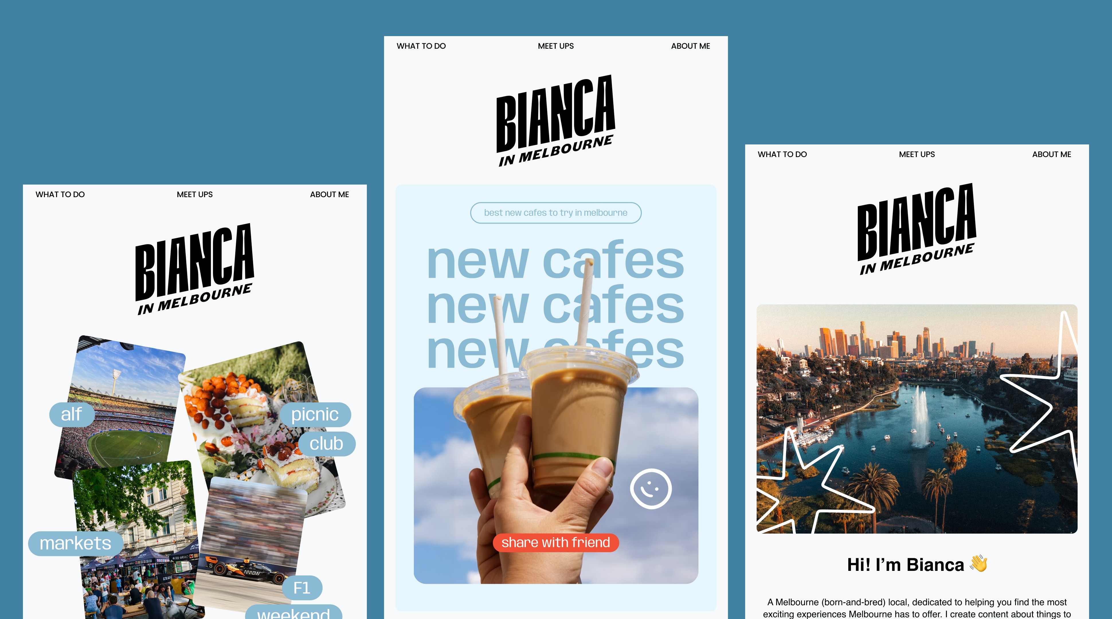
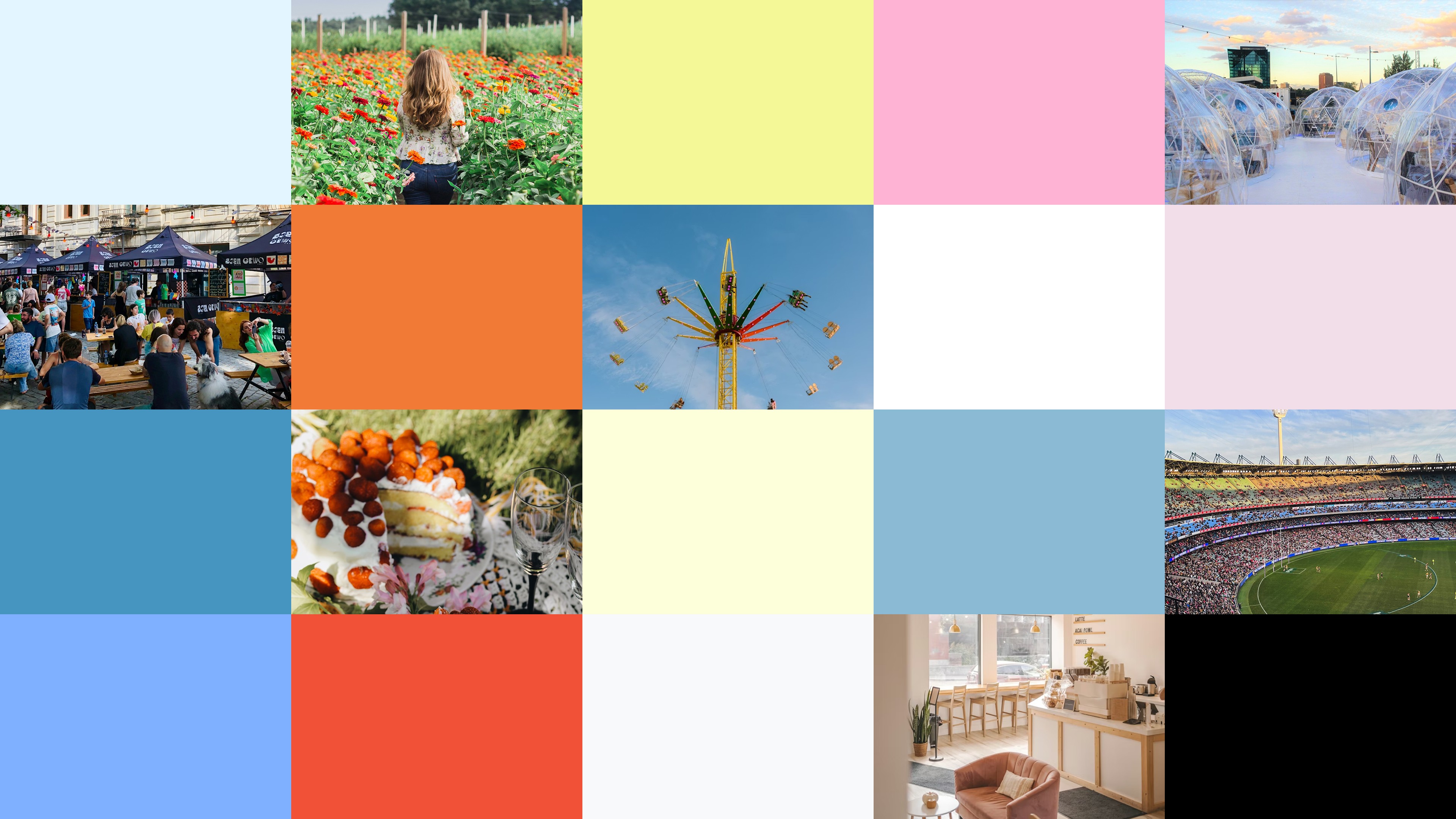
Visual identity — extended Bianca's colour palette for flexibility, and introduced Anybody, a free Google-licensed typeface, for a polished but approachable social voice without licensing friction.
Content strategy — two directions presented: a scrapbook × editorial hybrid (memory-driven, star/pattern motifs, more polished layout) and Friendship in Motion (rotated, sticker-style type, spontaneous energy). Same categories and colour logic, different energy — giving Bianca real choice.
Welcome email & newsletter — built on a fixed skeleton (nav, hero welcome, intro block, community CTA, channel cross-promotion) with swappable monthly content — consistent each send, no rebuilding from scratch.
Reel cover system — covers act as accents, not competition for the imagery. Each category gets its own treatment (typographic stamps, sticker pills, minimal trend-friendly covers, generic flexible style), legible at a glance.
Emails and covers were designed in parallel, not sequentially, so the visual language could be cross-checked across both — directly supporting the cross-platform goal.

Key Features and Highlights
Content-category cover system — gives the feed structure and gives Bianca's team a clear template to reach for
Repeatable email skeleton — turns newsletters into a content-fill exercise, not a rebuild
Extended colour palette — room for mood without losing consistency
Dual creative concepts — real ownership over the brand's final tone

Results and Impact
Newly delivered, so outcomes are qualitative — no performance data yet.
A previously undefined brand now has a documented system spanning email and social
The email templates bring the owned channel up to the polish level of the social content
A named taxonomy gives the brand room to scale as new content types emerge
The parallel design process sets a foundation for feed and email to feel like one brand
Strategic Insights
Personal brands need systems, not just style — the KIC benchmark showed that the most "personal" brands at scale are often the most systemised behind the scenes. Structure protected Bianca's authenticity rather than threatening it.
Categorise by content type, not aesthetic preference — the best taxonomy came from observing existing patterns, not imposing new ones — a transferable lesson for prolific creators.
Design owned and rented channels together — designing emails and Reel covers in parallel surfaced inconsistencies early that separate workstreams would have missed.