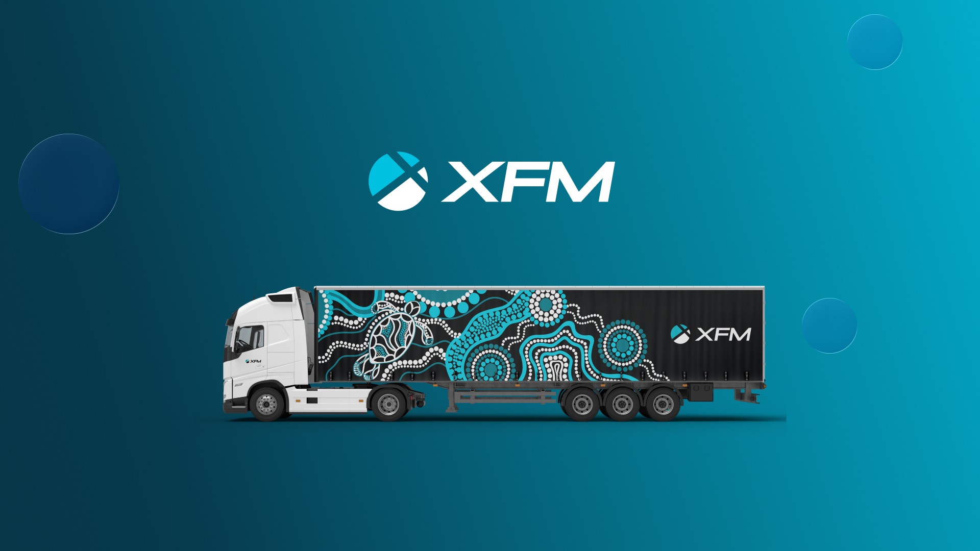
XFM Brand Identity
Client Name
XFM (Xpress Freight Management)
Service Offered
Brand Identity
Project Kickoff
Partnership
4
XFM: A Brand Identity Built for the Road Ahead
The Client
XFM (Xpress Freight Management) is one of Australia's fastest-rising logistics companies — a true industry disruptor taking on tier-one competitors not by playing the same game, but by refusing to. XFM doesn't want to be just another operator. Their vision is to be an Extraordinary Operator, built on relationships and a deliberately different approach to freight.
The Challenge
XFM already had a presence across road freight transport, but the existing identity no longer reflected the business it had become. The challenge wasn't to start from scratch — it was to evolve the brand without losing what made it recognisable, while finally aligning the visual identity with the company's true focus: road freight.
That meant a delicate balance. Strip back the outdated symbols that no longer earned their place. Rework the mark into something bold, grounded and instantly recognisable on the side of a truck or the top of a webpage. And do it in a way that felt like a natural next step for XFM, not a different company wearing a new logo.
The Approach
The rebrand started with the mark itself — simplified, sharpened and reworked to feel confident and strong at any size, from a business card to a 19-metre trailer. Outdated symbols were stripped back in favour of something cleaner and more deliberate, distinctly XFM rather than generic freight-industry iconography.
That clarity carried through every part of the system. A simplified colour palette and refined typography brought consistency across touchpoints, while reinforcing the values the business actually runs on: reliability, clarity and forward motion. Nothing about the new identity was decorative — every choice was made to reflect how XFM operates, not just how it looks.
The Result
The new identity gives XFM a presence that feels confident, grounded and unmistakably its own — on the road and online. It's a brand mark built to do the heavy lifting, recognisable at speed on the highway and just as strong at a desktop scale.
This was the starting point of an ongoing partnership, not a one-off project. Hi Blue continues to work closely with XFM to roll the new identity out across the business, including a full website redesign, internal brand strategy, and updated marketing and signage systems — embedding the brand into every part of how the company shows up.

